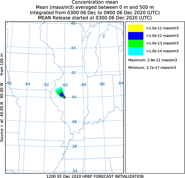
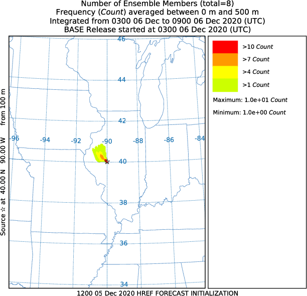
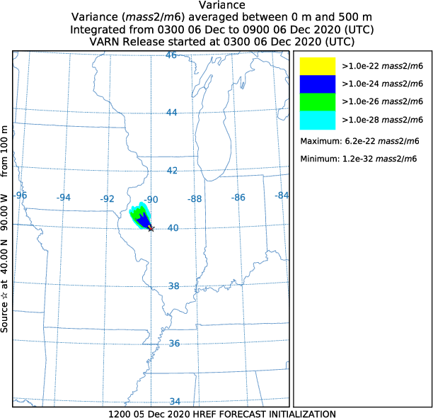
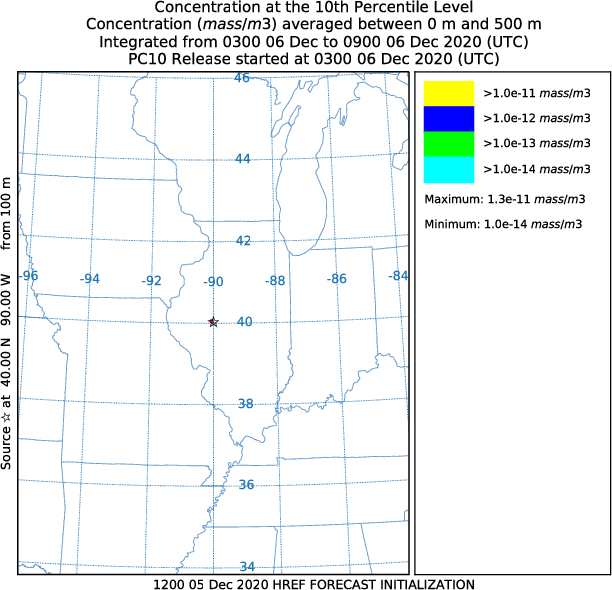
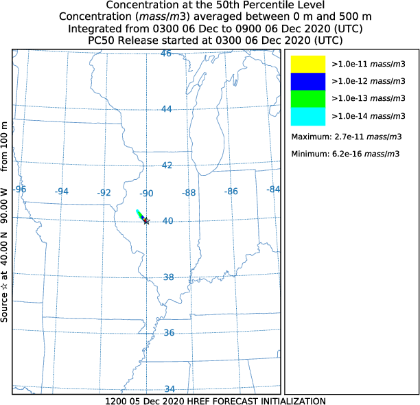
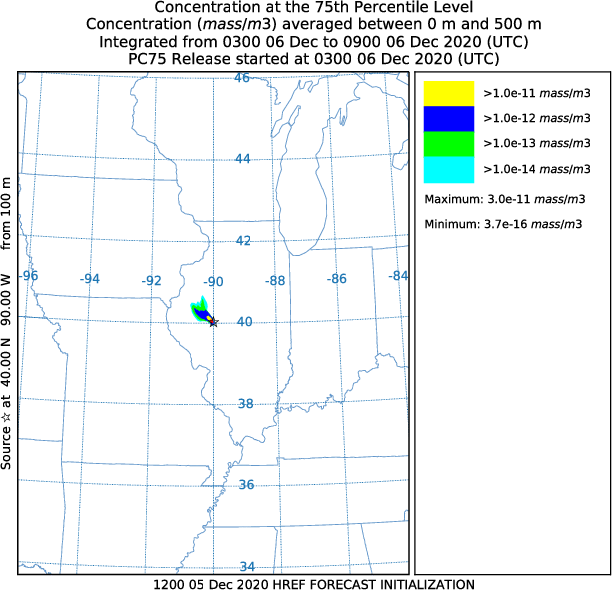
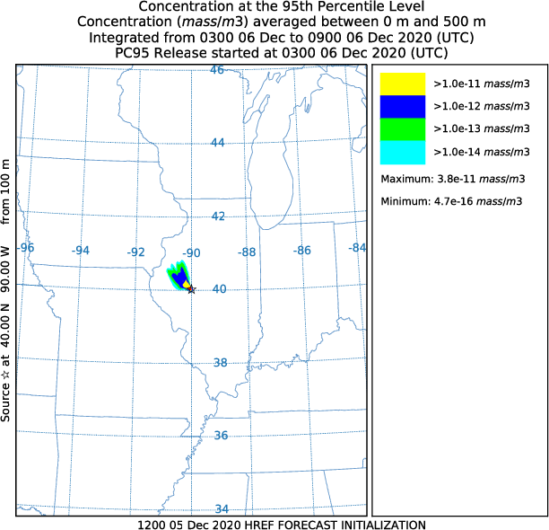
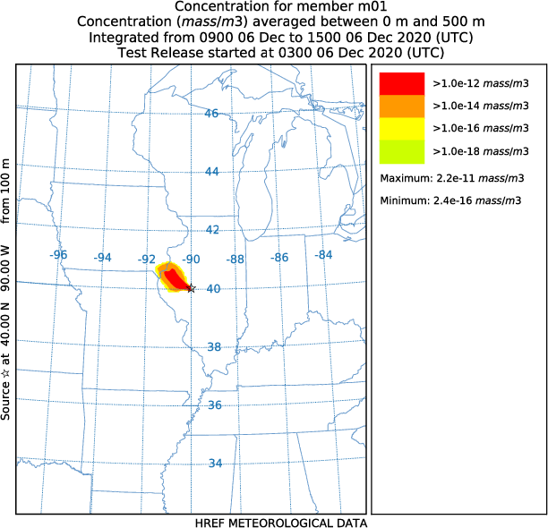
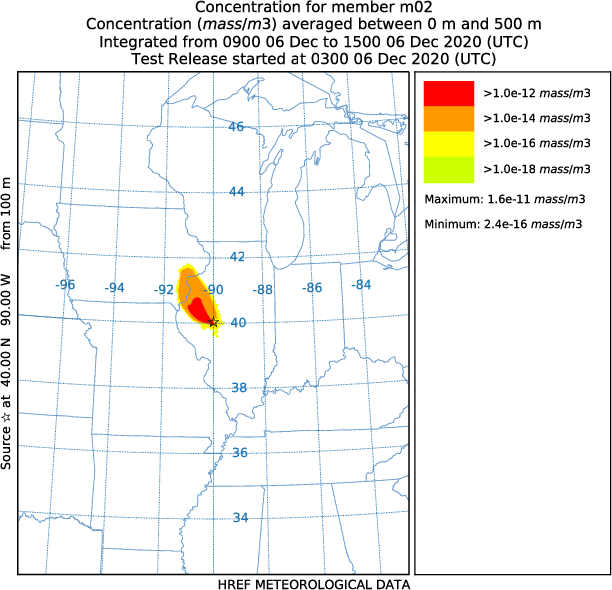
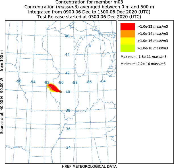
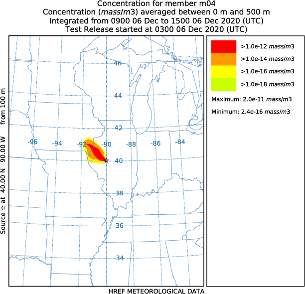
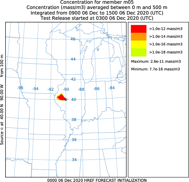
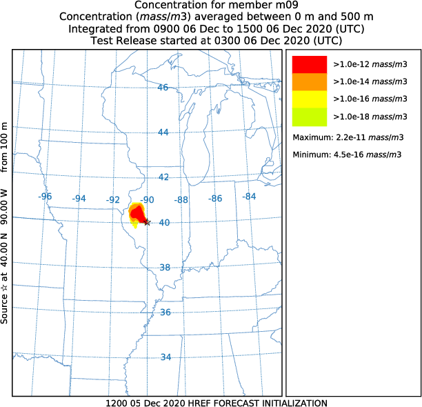
Air Resources Laboratory banner image
Air Resources Laboratory web site National Oceanic and Atmospheric Administration (NOAA)
READY logo

HYSPLIT HREF Dispersion Forecast

EXPERIMENTAL - information may not be current.

Over the past few years, the use of dispersion model ensembles has been an increasingly attractive approach to predict atmospheric transport. The ensembles are generally constructed by combining multiple numerical weather prediction simulations or output from different dispersion models, by introducing variations in a particular model's physics parameterizations, or by different combinations of these variations. In addition, the source term and height distribution can be varied to create dispersion ensembles.

For this application, we create a HYSPLIT ensemble simulation using the 10 meteorological model members from the National Weather Service (NWS) High-Resolution Ensemble Forecast (HREF) that is scheduled for implementation in December 2020. The HYSPLIT model runs are generated by using the Transfer Coefficient Matrix procedure that is updated with the most recent meteorological data at 00, 06, 12 and 18Z.

Note that the products may not be current because they are experimental. Output from the HREF itself may not be available and our experimental dispersion runs will occasionally be pre-empted by NCEP operations.

The figures below show each of the simulation ensemble members as well as a series of statistical measures that describe the ensemble properties such as:

  1. The spatial distribution of the number of members producing concentrations greater than zero.
  2. The mean concentration of all ensemble members.
  3. The variance of all ensemble members (the mean square difference between individual members and the mean).
  4. The coefficient of variation of all ensemble members (the square root of the variance*100 divided by the mean).
  5. The probability of concentration produces contours that give the probability of exceeding a fixed concentration value at one of three levels: 1% of the maximum concentration, 10% of the maximum, and the maximum concentration. The maximum is determined to be the first concentration to a power of 10 that is less than the actual maximum value (exponent of 10). The concentration level for the probability display is shown on the graphic with the pollutant identification field set to something like C14, where 14 represents the concentration to the power of 10-14.
  6. The concentration at percentile levels shows the concentration contours of areas where concentrations will be exceeded only at the given probability level. The probability level choices through the menu are limited to 50, 90, and 95th percentiles.

Refresh/reload your browser for the most recent images. Click on a thumbnail image to expand. The charts are updated four times per day (~00, 06, 12, 18 UTC).


Mean Number of members Variance Coefficient of Variation
Mean Number of members Variance Variance
Probability that concentration exceeds
1% of maximum value 10% of maximum value 100% of maximum value
Probability that concentration exceeds 1% of maximum value Probability that concentration exceeds 10% of maximum value Probability that concentration exceeds 100% of maximum value

Concentration at:
5th percentile 10th percentile 25th percentile 50th percentile
Concentration at 5th percentile Concentration at 10th percentile Concentration at 25th percentile Concentration at 50th percentile
75th percentile 90th percentile 95th percentile
Concentration at 75th percentile Concentration at 90th percentile Concentration at 95th percentile

Individual member plots
m01 m02 m03 m04
m01 member m02 member m03 member m04 member
m05 m06 m07 m08
m05 member m06 member m07 member m08 member
m09 m10
m09 member m10 member


NOTICE:
This web page is under development and is experimental.
Products may change without notice.
Concentrations are relative to the source of 1 unit.
Contour values may vary from day to day and chart to chart.

Modified: June 11, 2020
US Dept. of Commerce |  NOAA |  NOAA Research |  ARL